Ihre Kommentare
So we are talking more about an additional view to the tag sidebar
where we can click on a tag and all its notes are shown.
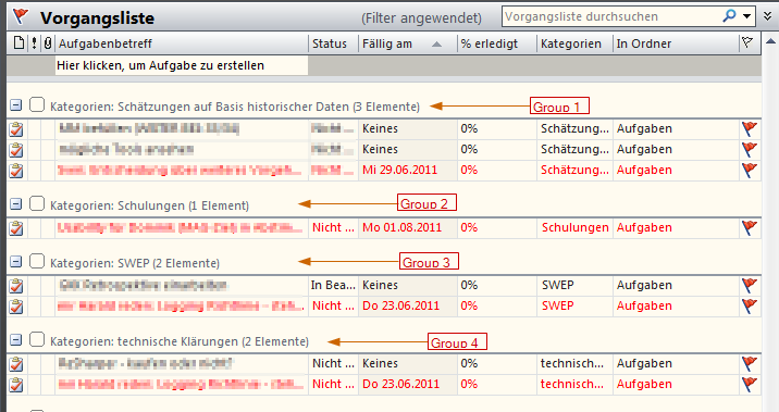
We are NOT talking about grouping the notes like e.g. Outlook does:

The reason I am asking is: I am still searching for a way to get more structure in a long list of notes. That's why I suggested a note grouping by tags here: http://roadmap.cintanotes.com/topic/3388-note-grouping/
where we can click on a tag and all its notes are shown.
We are NOT talking about grouping the notes like e.g. Outlook does:

The reason I am asking is: I am still searching for a way to get more structure in a long list of notes. That's why I suggested a note grouping by tags here: http://roadmap.cintanotes.com/topic/3388-note-grouping/
I am very interessted in this suggestion - especially in the part with 'grouping'. But I can't imagine how this could/would/should look like. The examples always show a hierarchy of tags - but grouping would mean to present the notes in such a way.
So are we talking about an additional view for the tags or a different view for the notes?
Do you have a ready vision of how it should look like?
Would it be like:
_______________
GROUP: customer-A/project-A
- note belonging to this group (which means to both tags)
- another note belonging to this group
- ...
_______________
GROUP: customer-A/project-B
- note belonging to this group (which means to both tags)
- another note belonging to this group
- ...
If you like this idea you may also like:
Sort search result by relevance (e.g. tag is more important than text)
Sort search result by relevance (e.g. tag is more important than text)
If you like this idea you may also like:
> Sort search result by relevance (e.g. title more important than text)
and
> different sorting methods for "search" vs "browsing-the-tag-sidebar"
> Sort search result by relevance (e.g. title more important than text)
and
> different sorting methods for "search" vs "browsing-the-tag-sidebar"
Just as a reminder - discussed here:
http://www.cintanotes.com/forum/viewtopic.php?f=3&t=1343&p=5200#p5203
We should not forget to enable tag suggestions in the search box even if the search is limited to title, text and so on.
http://www.cintanotes.com/forum/viewtopic.php?f=3&t=1343&p=5200#p5203
We should not forget to enable tag suggestions in the search box even if the search is limited to title, text and so on.
Is this the same/similar problem like this one?
http://roadmap.cintanotes.com/topic/86931-option-to-keep-the-current-tag-selection-active-after-removing-a-tag-from-a-note/
http://roadmap.cintanotes.com/topic/86931-option-to-keep-the-current-tag-selection-active-after-removing-a-tag-from-a-note/
"however since there is no keyboard shortcut for Ctrl+Clicking on a tag,
..."
Well, as for me, there shoud be one ;-).
I really miss this feature and therefore requested it here:
http://roadmap.cintanotes.com/topic/105239-workaround-for-search-as-you-type-not-really-useful-for-tags/
Well, as for me, there shoud be one ;-).
I really miss this feature and therefore requested it here:
http://roadmap.cintanotes.com/topic/105239-workaround-for-search-as-you-type-not-really-useful-for-tags/
@Thomas: Sorry, I missed your question.
@Alex: exactly. Thanks for explaining it in different words.
@Alex: exactly. Thanks for explaining it in different words.
Thanks for your clarification.
Just one additional thought from my side:
I don't see the sidebar as 'by design mouse-oriented' only. I agree that this is the primary purpose. But (at least for me) there is a secondary use: the sidebar is a visual element that - combined with this request - can get me a quick clue which tags are left to narrow down my search.
Customer support service by UserEcho


In addition to my comment to group also by tag names let me give you an example how this is done in Outlook:
and yes, Outlook is also showing the tasks more than once if they are assigned to more than one tag (in the pic called "Kategorien" which means "categories").